Avatar Extended
Extended Avatar components with rings, status badges, indicators, icons, and a built-in procedural fallback powered by the SpaceUI Avatars API.
Installation
pnpm dlx shadcn@latest add @spaceui/components-spaceui-avatar-extendedAnatomy
import { Avatar, AvatarImage } from '@/components/ui/avatar'
import {
  AvatarExtended,
  AvatarFallback,
  AvatarRing,
  AvatarBadge,
  AvatarIndicator,
  AvatarIcon,
} from '@/components/spaceui/avatar-extended'

export default () => (
  <AvatarExtended>
    <Avatar>
      <AvatarImage />
      <AvatarFallback>U</AvatarFallback>
    </Avatar>

    <AvatarRing className="ring-primary" />
    <AvatarIndicator className="bg-emerald-500" />
    <AvatarBadge>+6</AvatarBadge>
    <AvatarIcon>
      <IconCheck className="size-3" />
    </AvatarIcon>
  </AvatarExtended>
)
Features
Verified Icon & Company Logo
Use the AvatarIcon component to display small status indicators, verified badges, or company logos at the corner of the avatar.
Avatar Rings
Apply custom selection states or decorative borders using the AvatarRing component with standard utility classes.
AvatarFallback
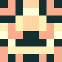
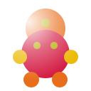
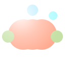
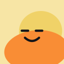
Generates a procedural avatar image from a name via the SpaceUI Avatars API. It replaces the primitive <AvatarFallback> with a rich, generated image instead of initials.
AvatarFallback Variants
Pass a variant prop to choose a specific style family. Defaults to 'all' which lets the API pick a random style.
Avatar Badges (Counts)
Display unread notifications or counters cleanly over the avatar using the AvatarBadge component.
API Reference
AvatarFallback
Generates a procedural avatar image from the SpaceUI Avatars API. Extends React.ImgHTMLAttributes<HTMLImageElement>.
| Prop | Type | Default | Description |
|---|---|---|---|
name | string | - | The name used to seed the avatar. Falls back to children if a string. |
variant | AvatarVariant | all | The visual style family. 'all' picks a random variant. |
AvatarVariant values:
| Family | Variants |
|---|---|
| Gradient | lumina shaula singularity triton solar-flare titan glass |
| Fluid | splash astronaut ghost bot glitch animals |
| Classic | pebble invader grunge bored doodle squiggle |
| Paletteless | critter kendo |
| All | all (random — default) |
AvatarExtended
The root wrapper component that establishes the relative positioning context. Extends React.HTMLAttributes<HTMLDivElement>.
| Prop | Type | Default | Description |
|---|---|---|---|
children | ReactNode | - | Must contain an Avatar and any of the extension components. |
AvatarRing
An absolute overlay that applies a decorative ring or focus outline around the avatar. Extends React.HTMLAttributes<HTMLSpanElement>.
No specific props. Use className to pass Tailwind ring utility classes (e.g. ring-primary ring-offset-2).
AvatarIndicator
A small status dot positioned at the bottom right by default, used for online/offline states. Extends React.HTMLAttributes<HTMLSpanElement>.
No specific props. Use className to set the color (e.g. bg-emerald-500).
AvatarBadge
A notification counter or badge positioned at the top right. It wraps the standard Badge primitive. Extends BadgeProps.
| Prop | Type | Default | Description |
|---|---|---|---|
variant | default|destructive|error|info|outline|secondary|success|warning | default | The visual variant of the badge. |
size | default|sm|lg | sm | The size of the badge. |
square | boolean | true | Forces a square ratio for numbers. Fixed to true. |
AvatarIcon
A wrapper used to absolutely position small icons, logos, or verified checkmarks at the bottom right. Extends React.HTMLAttributes<HTMLDivElement>.
| Prop | Type | Default | Description |
|---|---|---|---|
children | ReactNode | - | The icon or logo element to display. |
Keep in mind
- MIT License: Free and open-source for personal and commercial use. Feel free to copy, tweak, and adapt the components to match your exact needs.
- Credits & Inspiration: Some components on this site are inspired by or recreated from great ideas across the web. I'm not here to take credit; just to learn, experiment, and push interface craft further.
- Reach out & Claims: If an attribution was missed, or if you have any inquiry or claim, feel free to reach out directly on X to @adrielzimbril. I'll be glad to update or resolve it right away.
Related Components
Avatar group stacking and overlapping system.
ViewAn interactive participant and member avatar selector with dynamic row layout, animated selection badges, quick-add button, and searchable popover.
ViewAccessible Avatar primitive component for Space UI.
View